

Introduction
CSS (Cascading Style Sheets) is the technology that brings websites to life. While HTML provides the structure of a webpage, CSS controls its appearance, layout, colors, fonts, spacing, and responsiveness.
Modern websites rely heavily on CSS to deliver visually appealing user experiences across desktops, tablets, and mobile devices.
What is CSS?
CSS is a stylesheet language used to describe how HTML elements should be displayed on a web page.
With CSS, developers can:
- Change colors and fonts
- Create layouts
- Add animations
- Improve responsiveness
- Enhance user experience
Why CSS is Important
Without CSS, websites would appear as plain text and basic elements.
CSS helps developers:
Improve User Experience
A visually attractive website keeps visitors engaged.
Build Responsive Layouts
CSS allows websites to adapt to different screen sizes.
Maintain Consistency
A single stylesheet can control the appearance of an entire website.
Improve Performance
Well-optimized CSS reduces page loading time and improves usability.
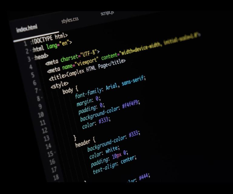
CSS Syntax
A basic CSS rule consists of a selector and declaration block:
h1 {
  color: blue;
  font-size: 32px;
}
In this example:
- h1 is the selector
- color and font-size are properties
- blue and 32px are values
Ways to Add CSS
Inline CSS
<p style="color:red;">Hello World</p>
Internal CSS
<style>
p {
 color: green;
}
</style>
External CSS
<link rel="stylesheet" href="style.css">
External CSS is the most recommended approach.
Essential CSS Properties
Colors
body {
  background-color: #f5f5f5;
}
Typography
p {
  font-size: 16px;
  font-family: Arial, sans-serif;
}
Margins and Padding
.container {
  margin: 20px;
  padding: 15px;
}
Borders
.card {
  border: 1px solid #ddd;
}
CSS Flexbox
Flexbox simplifies layout creation.
.container {
  display: flex;
  justify-content: center;
  align-items: center;
}
Benefits:
- Easy alignment
- Flexible layouts
- Responsive design
CSS Grid
Grid Layout is ideal for complex page structures.
.container {
  display: grid;
  grid-template-columns: 1fr 1fr 1fr;
}
Grid provides precise control over rows and columns.
Responsive Web Design
Responsive design ensures websites work on all devices.
Media Query Example
@media (max-width: 768px) {
  .container {
    width: 100%;
  }
}
Responsive websites improve user experience and SEO rankings.
CSS Animations
Animations make websites interactive.
button:hover {
  transform: scale(1.1);
}
Common animation uses:
- Hover effects
- Loading indicators
- Navigation transitions
- Interactive buttons
CSS Best Practices
Use External Stylesheets
Maintain cleaner and reusable code.
Organize CSS Properly
Group related styles together.
Minimize Unused CSS
Reduce file size and improve performance.
Follow Naming Conventions
Use meaningful class names.
Test Responsiveness
Verify layouts across multiple devices.
Future of CSS
Modern CSS continues to evolve with:
- CSS Variables
- Container Queries
- Advanced Grid Features
- Improved Animations
- Better Accessibility Support
Developers who stay updated with these features can build faster and more modern web applications.
Conclusion
CSS is a fundamental skill for every web developer. It transforms basic HTML pages into professional, responsive, and engaging websites. By mastering CSS concepts such as Flexbox, Grid, Responsive Design, and Animations, developers can create outstanding digital experiences that work seamlessly across all devices.